Booklet Design
Goal:
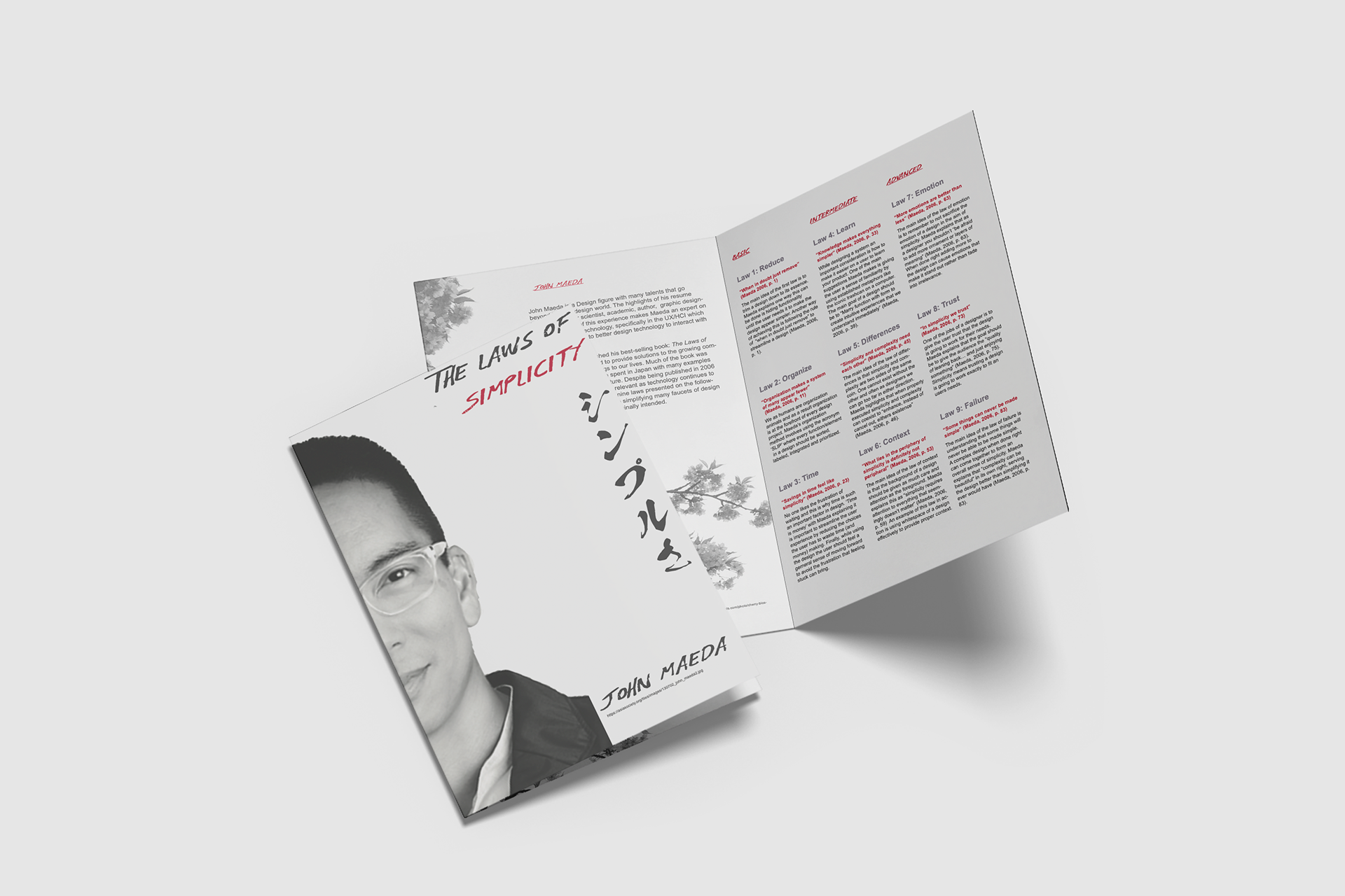
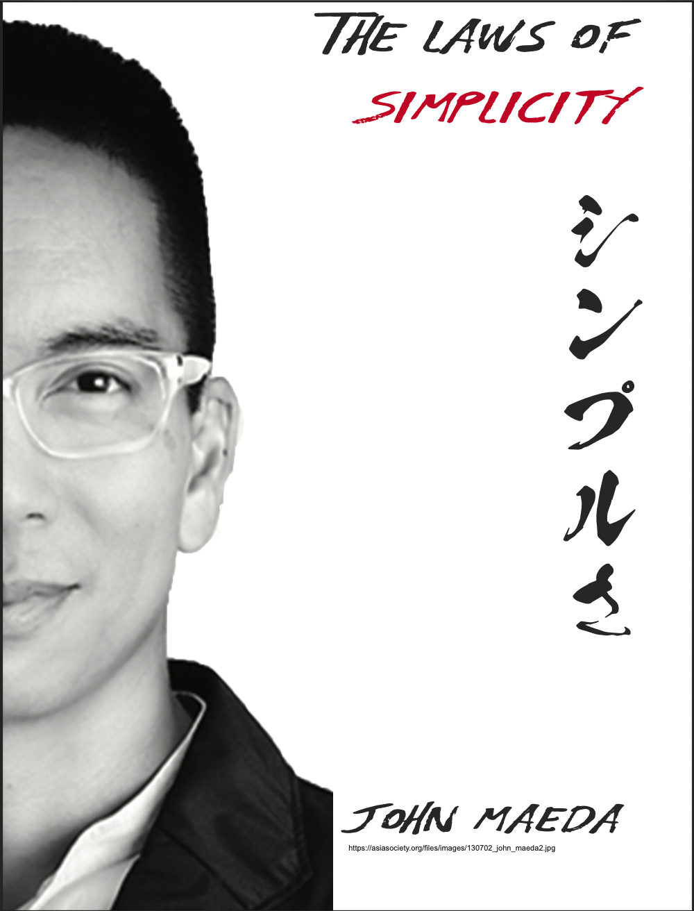
Design a booklet which profiles John Maeda with a focus on his book: The Laws of Simplicity.
Project Statement:
This project involved profiling a designer, identifying a design problem they worked on, and the method the designer used when approaching the problem. The process for completing this involved first researching, writing, explaining and visualizing the problem in the form of a 7.5x10x5" folded booklet using a 6 column grid.
Date: December 2021
Project Type: School
Scope of project: Booklet Design
Role: Designer/Writer
Collaborators: Individual
Skills: InDesign, Document Design, Research, Sketching


Strategy:
In the creation of the document I first performed research generating notes on both John Maeda and his book. From these notes I developed a content outline to list all the information important to include in the document.

Content Outline
At this stage I also began to develop the main theme of the final document being based around keeping it as simple as possible. From here, I began to sketch all the elements in my sketchbook to get an idea of how I would layout everything in InDesign and decided on using a 6 column grid. I also needed to make decisions about typography and in keeping with the theme I decided to use a simple sans-serif font Arial for the body text and a script type font Odachi to distinguish major headings and titles.
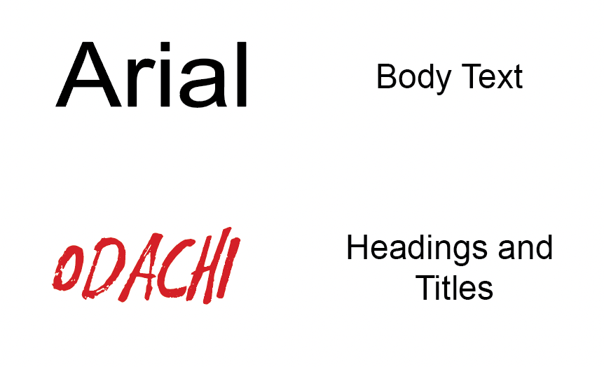
Typography Used in the Booklet
I then developed written content which summarized the designer and boiled down the main points to a few sentences to highlight what was important. Finally, I used document design principals to establish different levels of hierarchy within the document to aide in the ease of scanning to assist the reader in finding what's relevant to them.

Learning Outcomes:
Through this project I learned about John Maeda and his book, The Laws of Simplicity where he outlines 10 points for keeping content (websites, documents, posters, etc.) simple. One of the most impactful insights I gained from this book was the idea of not needing to reinvent the wheel for every design project. Often we strive too hard to innovate and create something unique. This then becomes frustrating for users who are faced with something completely foreign to what they are used to. I tried to apply principals like this to the final document while also learning how to work with a 6 column grid. I also practised the skill of taking a large piece of text like a chapter of a book and summarizing it in only a few sentences to give the reader the main idea. Finally, I learned how to use typography in combination with text sizing/placement to create a hierarchy that is scannable at a glance to allow for a reader to find what they are looking for quickly and easily.